
Do All of Clint Eastwood’s Movies Really Look the Same? We Investigate
Over the past 12 years, with the help of his trusty director of photography, Tom Stern, Clint Eastwood helmed 11 films, a vast and rich filmography of features that spans time (from the late '20s to the contemporary era and just about everything in between), place (from Los Angeles to Iwo Jima, from South Africa to the Indian Ocean) and theme (hard-bitten historical bits to jazzy musicals). So why does every single one of those 11 pictures look exactly the same?
Or do they?
Stern lensed every Eastwood film of the past decade, first stepping in as director of photography on 2002’s ‘Blood Work,’ marking a big break between Eastwood and his then-go-to DP, Jack N. Green, a break that has never abated. Stern has been Eastwood’s only DP for those past 12 years (he even lensed the Eastwood-starring 'Trouble With the Curve,' which was directed by Eastwood's long-time producer and collaborator, Robert Lenz.
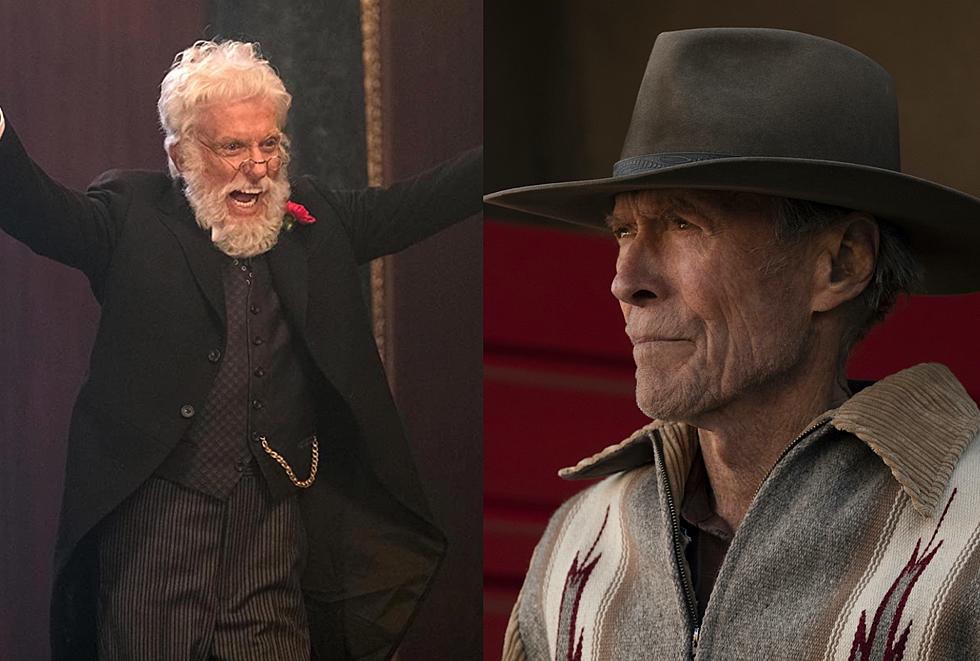
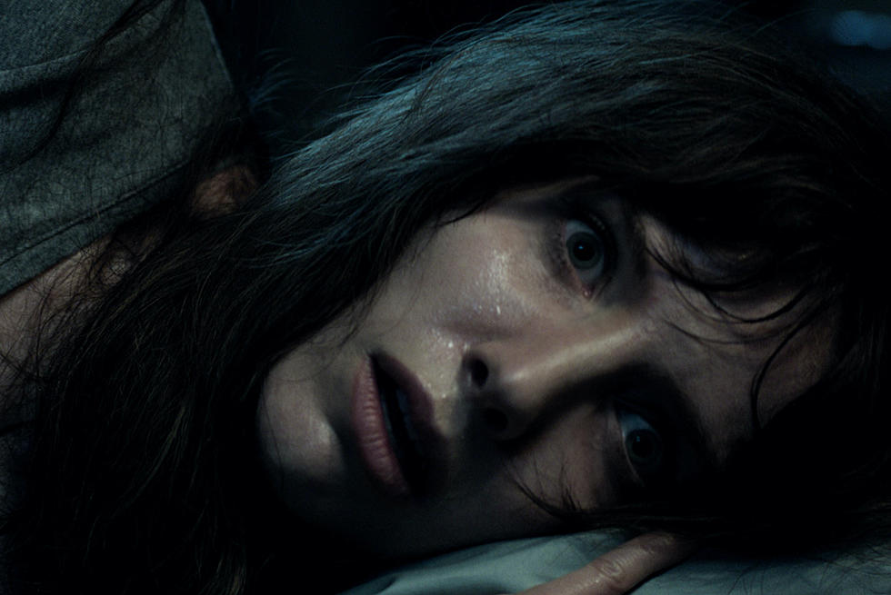
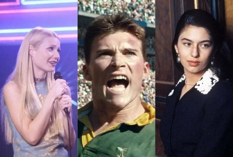
To wit, Stern served as DP on this week’s new release ‘Jersey Boys,’ historical bust ‘J. Edgar,’ wrong-headed drama ‘Hereafter,’ historical whatever ‘Invictus,’ angry old man drama ‘Gran Torino,’ the other historical bust ‘Changeling,’ the war film match set of ‘Letters from Iwo Jima’ and ‘Flags of Our Fathers,’ the game-changer ‘Million Dollar Baby,’ and the well-regarded ‘Mystic River.’
Stern and Eastwood’s work together has a distinctive, drab look – muted colors that verge into sepia tones more often than not, films that are void of energetic colors or bright lighting, no matter their time period or tone – and that style has carried over to some of Stern’s non-Eastwood films, but only in varying degrees. His ‘Hunger Games’ looks far crisper than anything Eastwood directed in over a decade, and the last thing French actioner ‘Sleepless Night’ lacks is popping color, even though it takes place in a dark nightclub.
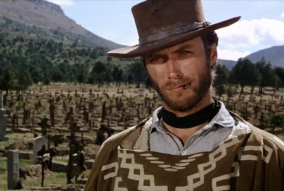
The early half of Eastwood’s career (1971 to 1988, or thereabouts) is comprised of films that appear (literally) to be products of either the time period in which they were made and released, or the genre they fall into. Eastwood’s Westerns look like Westerns. His '70s films look like '70s films. His '80s films, well, look like films from the '80s. Eastwood didn't go muted or washed out until the Stern years, and the result is a filmography of very different projects that all somehow manage to look the same, thanks to a professional pairing that seems to be bafflingly resistant to any kind of color use or lighting scheme that even implies "bright."
Do all of Clint Eastwood's films of the last decade really look the same? Well, pretty much, at least if our highly scientific color palette investigation is to be believed. Take a look:


All palette images created using ColorThief.
More From ScreenCrush