25 Movies That Changed Their Studio Logos In Awesome Ways
Before the first line of dialogue or scene, before the first appearance of the star or opening credit, there are the studio logos. These animated introductions have become ubiquitous (and sometimes, in the era of elaborate co-productions, a bit oppressive), but they are also the way all Hollywood films make their first impressions, and that’s why some directors adapt them to fit the specifications of their particular production. The ScreenCrush staff (okay just me) gets a big kick out of movies that do this well, so we (I) decided to honor the filmmakers who feel the same way with this lengthy (but by no means authoritative list) of our (my) favorites. In rough chronological order (with a few exceptions to group multiple films by one director together), here are ...
25 Movies That Changed Their Studio Logos In Awesome Ways
1. ‘Cat Ballou’ (1965)
Directed by Elliot Silverstein
The Columbia Torch Lady morphs into an animated version of the lead character, who tosses off her robes and starts shooting into the audience. I should not have to explain to you why this is absolutely fantastic.
2. ‘The Cannonball Run’ (1981)
Directed by Hal Needham
There are so many car chases in stuntman-turned-film-director Hal Needham’s ‘Cannonball Run’ they even spill over into the studio logo, where an animated racer speeds around the art deco Fox sign just ahead of a police cruiser. This logo is so Needham: Cars are gonna race, things are gonna get smashed, and everyone’s going to have a damn good time doing it.
3. ‘Strange Brew’ (1983)
Directed by Rick Moranis & Dave Thomas
Everyone recognizes the old MGM logo and its famous, roaring Leo the Lion, but he looks (and sounds) significantly different in ‘Strange Brew,’ where Bob and Doug McKenzie (Moranis and Thomas) prepare viewers for their subversive comedy by wandering into a shot of a belching, lazy lion, heckling him, and then running away when he gets mad.
4. ‘O.C. and Stiggs’ (1985)
Directed by Robert Altman
Here’s another great spoof of the grandiose MGM logo, this one from a little-seen Robert Altman comedy. Instead of a glorious roar, Leo unleashes the names of the two main characters, in a voice that is decidedly less than glorious. Altman loved to screw with audience’s expectations and subverting a classic logo is always a good way to do that; he also used a similar gag in ‘Brewster McCloud.’
5. ‘The ’Burbs’ (1989)
Directed by Joe Dante
The fact that the Universal Picures logo is a globe has invited many iterations that involve zooming into a particular spot on the Earth from space. The best of the bunch is clearly the one from Joe Dante’s ‘The ’Burbs,’ which goes all the way from space to the humble suburban cul-de-sac where the film takes place in one incredible, continuous shot.
6. ‘Alien 3’ (1992)
Directed by David Fincher
Everything about this 20th Century Fox logo is standard until the moment near the famous Fox fanfare’s conclusion where the orchestra holds on a note too long, and then so long that it becomes ominous. The tone for a terrifying sci-fi horror film has officially been set.
7. ‘The Curious Case of Benjamin Button’ (2009)
Directed by David Fincher
David Fincher puts a great deal of care into all the little details in his movies, so it’s no wonder that several of his films have really interesting studio logos. As an orchestra warms up for ‘The Curious Case of Benjamin Button,’ the frame dissolves into the logos of Warner Bros. and Paramount Pictures, both given makeovers from hundreds of tiny buttons. It really sets the mood for the slightly surreal world of the film.
8. ‘Waterworld’ (1995)
Directed by Kevin Reynolds
Similar to ‘The ’Burbs’’ zoom, but arguably even more appropriate since the film is set in a dystopian world where the polar ice caps have melted and the last remnants of mankind live at sea, drinking their own urine. As the camera approaches the Earth, the waters rise, and the land vanishes. It’s obvious, given the subject matter, but very effective.
9. ‘Conspiracy Theory’ (1997)
Directed by Richard Donner
The Warner Bros. shield looks totally ordinary at first, but then the camera pulls back to reveal it’s actually a billboard on the side of a New York City bus. It’s a simple but ingenious way to immediately establish this paranoid thriller’s tone; things in this movie, it announces, are not what they initially appear to be.
10. ‘You’ve Got Mail’ (1998)
Directed by Nora Ephron
This ‘Shop Around the Corner’ for the early digital era opens with the sounds of the Internet circa 1998: hard-drives booting, keyboards clacking, printers revving. And then the Warner Bros. logo gets a Windows 95-era makeover, and merges into a desktop wallpaper, where it joins a fleet of icons that includes a folder, Microsoft Word, and America Online (kids, ask your parents to explain that one). It fits this online romance perfectly, and now the images are so hilariously dated that they’re the first big laugh in the movie.
11. ‘Hard Rain’ (1998)
Directed by Mikael Salomon
The rainy variant of a sunny logo is a popular one (see also: Roland Emmerich’s ‘The Day After Tomorrow’), but credit to the Christian Slater thriller ‘Hard Rain’ for being one of the very first, and for seamlessly flowing from magic-hour sunset to foreboding thunderclouds, and then panning down into the start of the film proper with a crack of thunder.
12. ‘The Flintstones in Viva Rock Vegas’ (2000)
Directed by Brian Levant
By all accounts, the 2000 sequel to the live-action ‘Flintstones’ movie was an disaster. But if nothing else, ‘Viva Rock Vegas’ got at least one thing right: Its fun Flintstone-ified take on the old Universal globe. There was a similar “Univershell” gag at the start of ‘The Flintstones,’ but—and this is surely the only context in which one could say this about ‘Viva Rock Vegas’—the joke was actually done better here.
13. ‘Moulin Rouge!’ (2001)
Directed by Baz Luhrmann
How do you instantly key your audience into the fact that your movie is a free-wheeling, free-associating musical? Baz Luhrmann did it by opening ‘Moulin Rouge!’ on a stage, where the curtain rises on the 20th Century Fox logo, which plays with its standard musical accompaniment, conducted by a man in the foreground who leads the orchestra with wildly exaggerated gestures. No one conducts that way, but then no one in 1900s Paris sang Nirvana songs either, so it fits.
14. ‘Jurassic Park III’ (2001)
Directed by Joe Johnston
One of the most famous moments from the first ‘Jurassic Park’ is the cup of water rippling as the T-Rex approaches. To introduce this second sequel, director Joe Johnston and his team created a nifty callback to the original, by adding the sound of lumbering footsteps and wattery ripples to the Universal and Amblin logos. (It’s not technically a studio logo, but the “III” in ‘Jurassic Park III’ being formed by a dinosaur slashing at the screen is so great too.)
15. ‘The Ring’ (2002)
Directed by Gore Verbinski
Adding grain or fuzz to a logo to mimic the low-res look of bad VHS is a trick a lot of movies try (even when it doesn’t always make perfect sense, like in ‘Swordfish,’ which is about computers, not old videotapes). It works and fits best in the American version of ‘The Ring,’ the modern horror masterpiece about a deadly VHS. Huge bonus points for the blink-and-you’ll-miss it ring that appears out of the “D” in DreamWorks and hints at the demonic tape’s ability to spread like a virus.
16. ‘The Grudge 2’ (2006)
Directed by Takashi Shimizu
Something about these American adaptations of Japanese horror films lends itself to tweaked studio logos. For ‘The Grudge 2,’ the Columbia Torch Lady transforms into (or perhaps gets possessed by) Kayako Saeki, the series’ long-haired ghost. The “Columbia” suddenly shifting into ‘The Grudge 2’ is a very nice touch as well.
17. ‘Men in Black II’ (2002)
Directed by Barry Sonnenfeld
For much of my lifetime, the Columbia Pictures logo has started with a close-up of a gleaming torch; it typically pulls back to reveal the “Torch Lady” in all her glory, some fine print, and a fade-out. For ‘Men in Black II,’ that torch becomes a nod to the Men in Black’s “neuralyzer,” a small pen-shaped gadget that erases people’s short-term memories with a blinding flash of light. Just before the logo fades away, the torch does sends off a neuralyzer flash—which is fitting, since that’s about all I remember from this bland sequel.
18. ‘Deja Vu’ (2006)
Directed by Tony Scott
As its title suggest, this detective story follows a cop who can move through time and relive past events with advanced technology. So the Touchstone and Jerry Bruckheimer Films logos set the table for what’s to come by introducing that concept very early, cycling forward and backward in time, and then replaying themselves from the beginning.
19. ‘Orphan’ (2009)
Directed by Jaume Collet-Serra
This horror flick is about an orphan whose cherubic exterior masks a scary secret. I like the way this Warner Bros. logo plays with that idea. In a certain light, it’s a typical, silver-on-black Warners shield. But in another, we see that it’s been defaced with wildly colorful paint. The audience has already been cued to pay attention before a single word has been uttered.
20. ‘TRON: Legacy’ (2010)
Directed by Joseph Kosinski
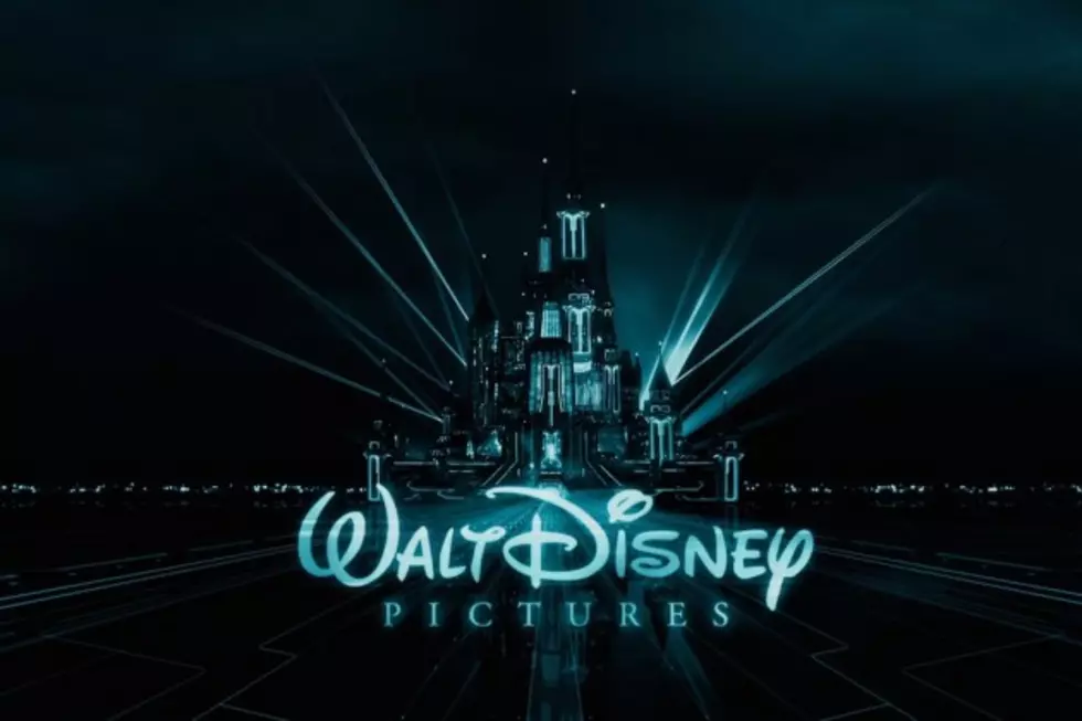
The iconic Cinderella Castle from countless Disney logos gets reimagined as a digital creation to match the computer world of Joseph Kosinski’s sequel.
21. ‘Oblivion’ (2013)
Directed by Joseph Kosinski
Another very shrewd Kosinski variation on a logo. (The guy arguably makes better logos than movies.) In this case, the standard Universal globe is replaced by a post-apocalyptic one—even the Universal name is missing its customary lights—suggesting the film’s ravaged world. Plus, there’s a great cameo by a spaceship that plays a crucial role in ‘Oblivion’’s conclusion.
22. ‘Legend of the Guardians: The Owls of Ga’Hoole’ (2010)
Directed by Zack Snyder
Zack Snyder is another director who loves to futz with studio logos. Although his logos for ‘300’ and ‘Watchmen’ are both cool, his best is probably ‘Legend of the Guardians,’ which features an owl (of Ga’Hoole) soaring through the Warner Bros. shield and the Village Roadshow emblem before gliding around the film’s title. This must have looked amazing in 3D.
23. ‘Scott Pilgrim vs. The World’ (2010)
Directed by Edgar Wright
For this comic-book adaptation about a twentysomething who sees the world through the prism of old-school video games, director Edgar Wright filtered the Universal logo through the prism of old-school video games as well. It’s like the opening of a great Nintendo classic that never existed. +1000 XP for the perfectly tinny chiptunes soundtrack.
24. ‘Catfish’ (2010)
Directed by Henry Joost & Ariel Schulman
Another tech-savvy riff on the tried-and-true Universal globe. For this tale of Internet deception, the traditional Universal earth is replaced by Google Earth, and instead of soaring over the planet, the ‘Catfish’ variation begins on the ground and zooms out. Audible mouse clicks and a visible onscreen cursor fill out the clever computer look.
25. ‘The LEGO Movie’ (2014)
Directed by Phil Lord & Chris Miller
This one’s a layup. It’s ‘The LEGO Movie’; of course the studio logos are going to be LEGO-ized. And that’s exactly what directors Phil Lord and Chris Miller did. It’s not a shocker, but it’s a winner anyway (and the clouds on strings are a great addition).
More From ScreenCrush
